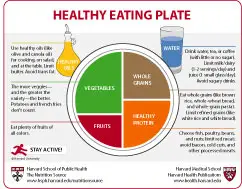
Back in June 2011, The U.S. government unveiled the “MyPlate” diagram, intended to give Americans a visual reminder for the proportions of the different components needed for healthy eating. It was an upgrade from the previous MyPyramid diagram that wasn’t... Read more