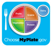
Back in June 2011, The U.S. government unveiled the “MyPlate” diagram, intended to give Americans a visual reminder for the proportions of the different components needed for healthy eating. It was an upgrade from the previous MyPyramid diagram that wasn’t particularly successful. The MyPlate diagram was a representation of what people will actually see when they sit down for a meal.
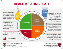
Unfortunately, the “MyPlate” icon was just a diagram and doesn’t provide much written information. So, a group of colleagues at the Harvard Health Publications and the Harvard School of Public Health got together to create an improved version. They call it the “Healthy Eating Plate.”

As with the “MyPlate” graphic, the “Healthy Eating Plate” provides a graphic version of a dinner plate, and shows the relative proportions of the different components of a healthy meal. However, it goes one step further and adds practical information relevant to each of those components. For example, beside the “Fruits” portion, it adds the note: “Eat plenty of fruits of all colors.”
You can download a free printable version of the “Healthy Eating Plate” at the Harvard Health Blog at:
http://www.health.harvard.edu/blog/harvard-to-usda-check-out-the-healthy-eating-plate-201109143344
If you’re looking for a good printable diagram for the nutrition component of your health classes, this is a great resource.
Dick Moss, Editor,
PE Update.com
To check out the PE Update.com website, Click Here!
To subscribe to the free Fun Stuff for PE Newsletter, Click Here!
[tags]Healthy Eating Plate,MyPlate,nutrition,diet,nutrition aids,nutrition graphics>[/tags]


